Context
Community Savings Credit Union, based in Vancouver, BC, serves over 30,000 members and manages $800 million in assets. Focused on supporting local unions and individuals, it offers a wide range of banking products and services to promote financial well-being.
Overview
1. The Problem
Many credit unions, including Community Savings, were experiencing a decline in younger members as their aging client base grew. With fewer younger members joining, modernizing the credit union's digital platform to attract this demographic became essential
2. The Challenge
We were tasked to redesign the user experience of the credit union's digital platform to resonate with and attract younger members, while ensuring usability and accessibility for all users.
3. The Research
Our research revealed several pain points. Younger users found the design unappealing, the color scheme monotonous, and the layout cluttered. This made it difficult to navigate and quickly find relevant information, frustrating first-time visitors and diminishing the digital experience.
4. Stakeholder Alignment
Through meetings with CSCU executives, we agreed on the need for a complete brand redesign. This included a refreshed color palette, more relevant imagery, a clearer copywriting style, and streamlined layout and information architecture, all tailored to appeal to a younger audience.
5. Deliverables
Our deliverables included sample redesigns and a full project estimation. These redesigns focused on improving accessibility, engaging younger members, and ensuring the platform would resonate with users of all ages.
6. The Outcome
80% improvement in task completion, 90% of users preferred the new style. Through usability tests on prototypes, comparing before and after assets, we observed an 80% improvement in user task completion accuracy. Additionally, 90% of users found the updated color scheme more inclusive and appealing.
Opportunity
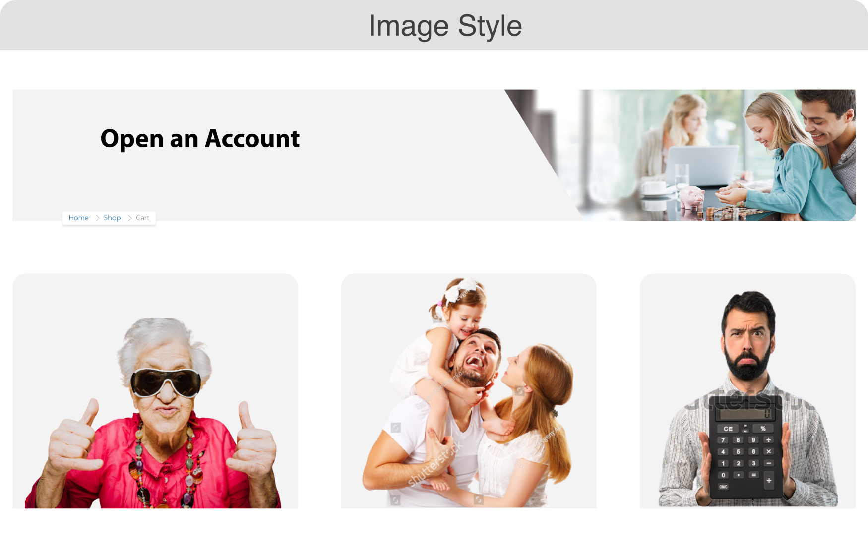
Imagery
The website was cluttered with large, tall images that took up valuable screen space and slowed down page load times. These visuals often lacked relevance and clarity, reducing their effectiveness in engaging users.
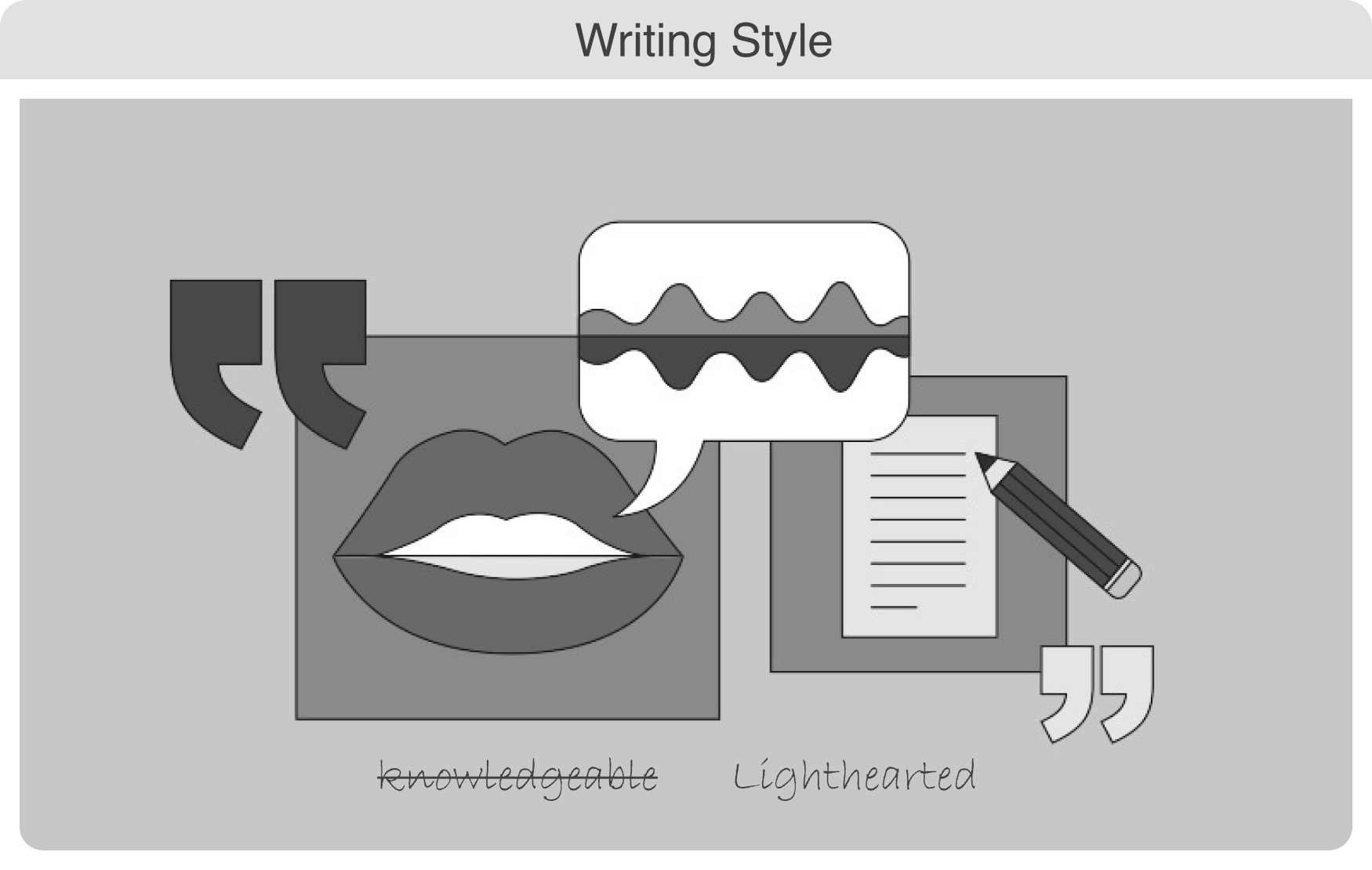
Copywriting

User testing revealed that crowded content areas were often overlooked, causing users to miss important information. Participants also struggled to interpret page headers, wasting time trying to understand them.
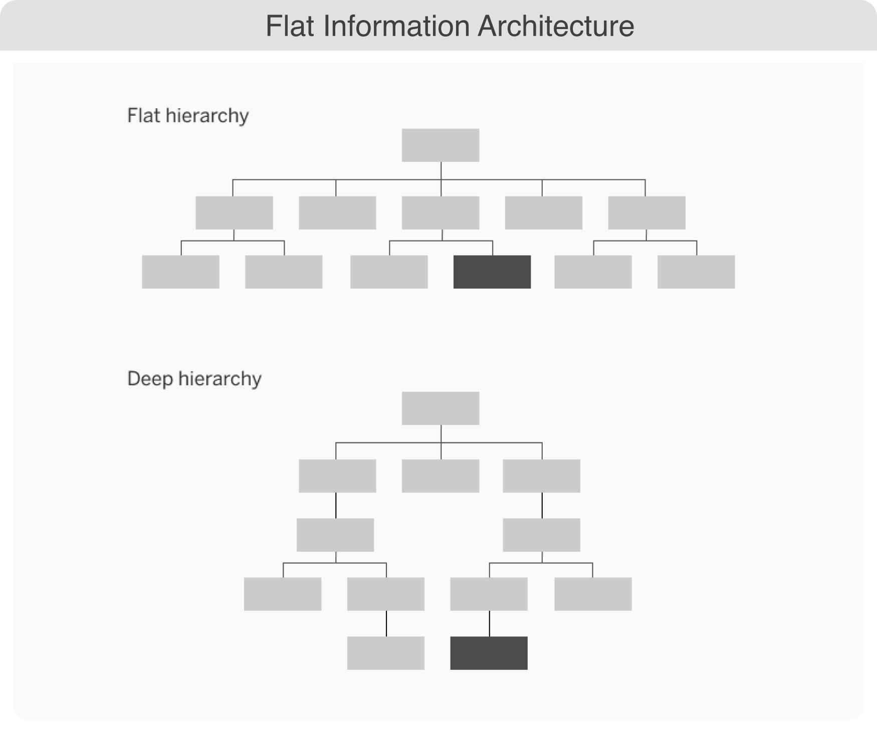
Information Architecture
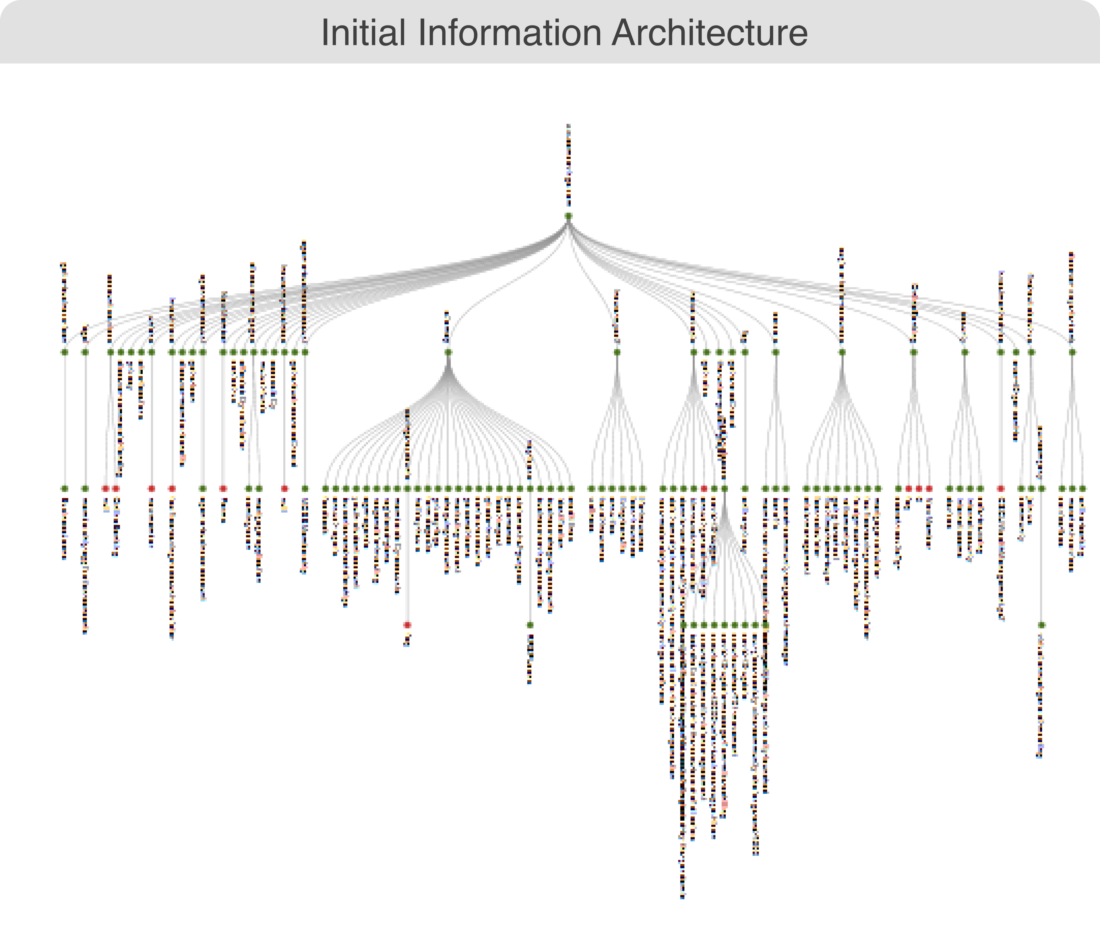
The website’s navigation was too deep, with seven levels, but most users only explored the first three. As a result, pages buried deeper down rarely received visits, leaving valuable content unnoticed for extended periods.
Accessibility
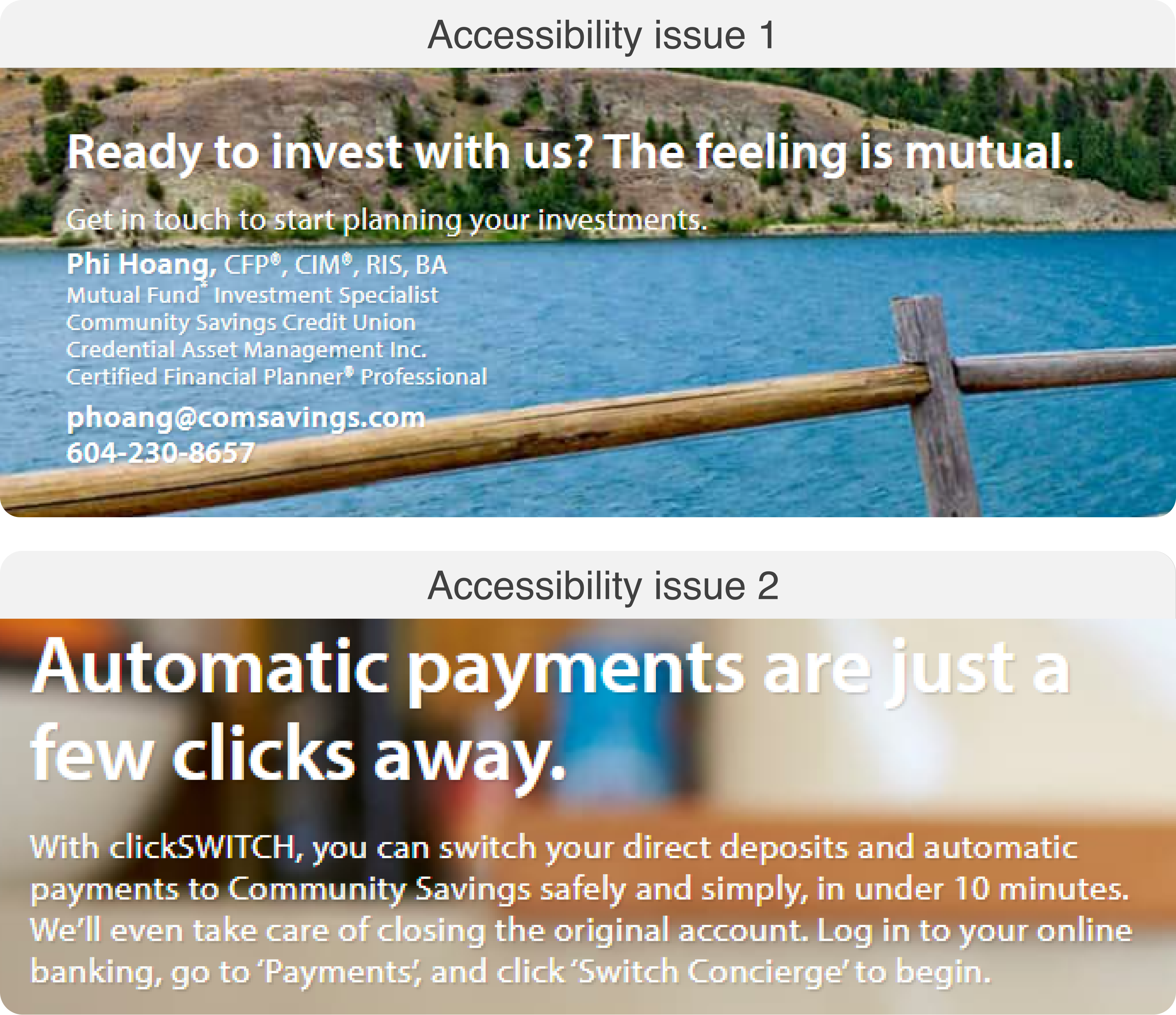
The website lacked sufficient contrast, making it difficult for some users, particularly the elderly, to read text. Inconsistent interactive elements added to the confusion, complicating the overall user experience.