Context
Community Savings is a local Credit Union in BC, proudly serving over 30,000 members and managing $800 million in assets. With a deep commitment to supporting local unions and families, it offers personalized banking solutions designed to strengthen the community and foster lasting financial well-being.
Overview
1. The Problem
A failed marketing campaign raised questions about the effectiveness of the assets used. Management needed actionable insights to turn things around quickly.
2. The Challenge
The mortgage campaign struggled to capture user interest, failing to engage the target audience and achieve its goals. We were tasked with uncovering the root causes of this disconnect and developing new digital assets to relaunch the campaign within a tight timeline.
3. The Research
Landscape research and user interviews uncovered critical issues. Users struggled with the landing page and calculator, finding them confusing and hard to navigate. This confusion led to low engagement and missed opportunities for meaningful user interactions.
4. The Solution
By listening to user feedback, we gained valuable insights that guided the creation of a prototype. Through iterative testing and refinement, we developed a custom landing page and calculator that delivered a more intuitive and seamless user experience.
5. The Result
In just three weeks, we conducted research and redesigned key assets, resulting in a revamped campaign that generated $50 million in mortgage loans, surpassing all expectations.
Assets
Initial Calculator
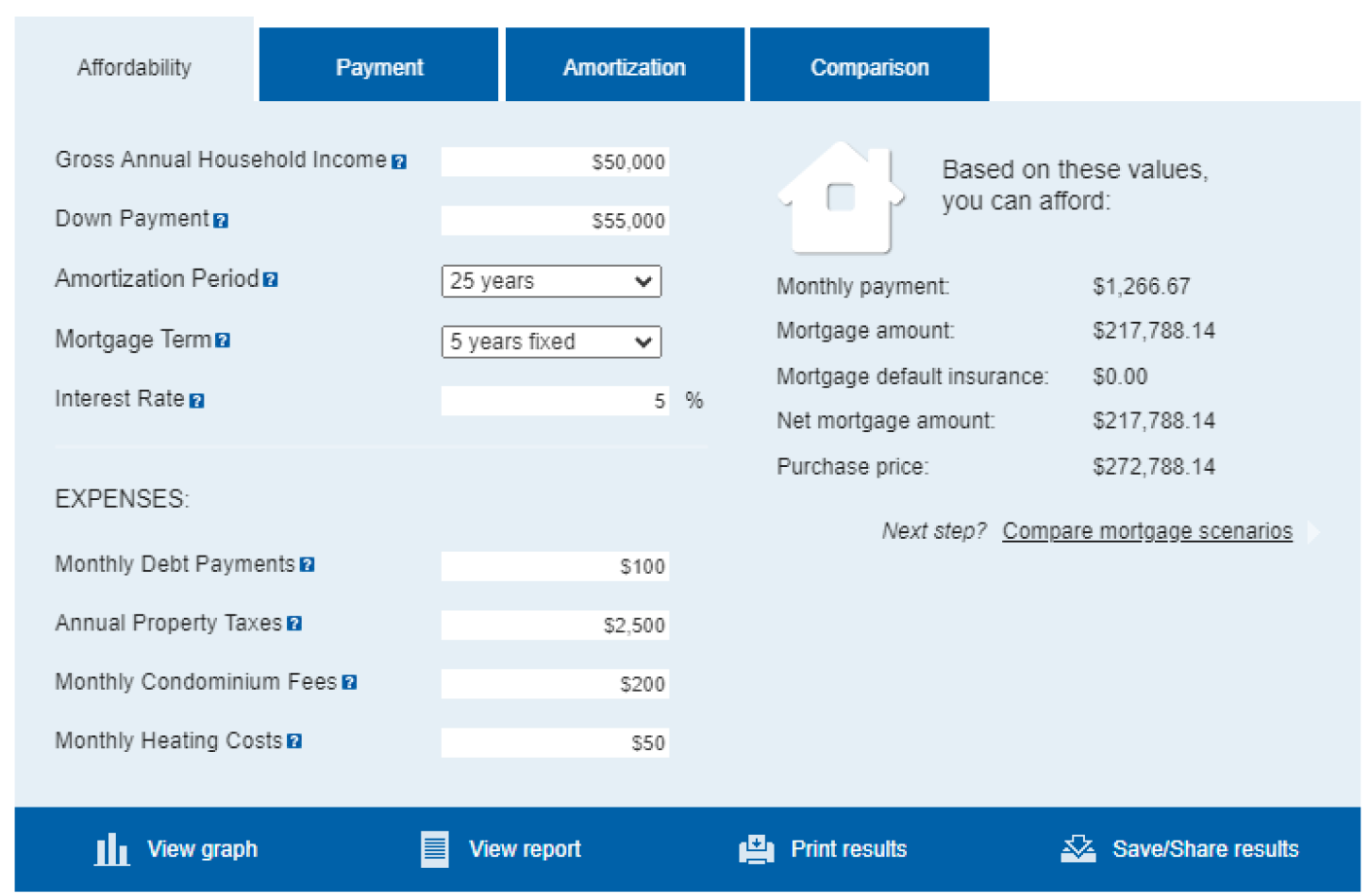
Users found the original calculator overwhelming, with confusing terms like 'amortization period' and unclear navigation. They struggled to proceed after entering information.
New Calculator
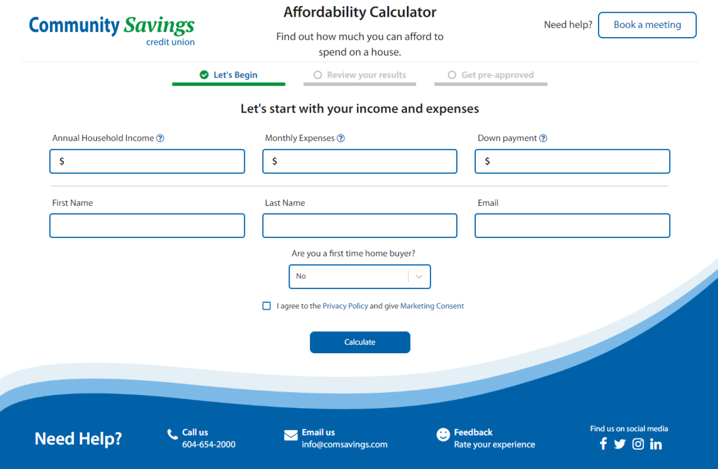
We simplified the calculator by reducing fields and creating a user-friendly design. By transforming it into a lead capture tool, we enabled staff to support users seamlessly.
Initial Calculator Result
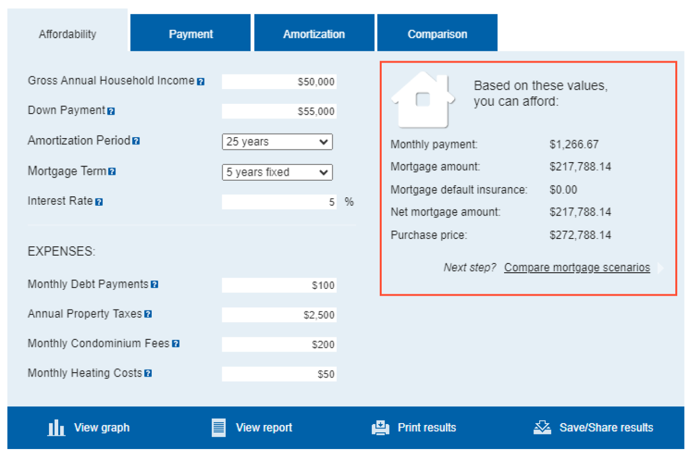
Users often missed the results section and felt unsure about the next steps, leading to confusion and dropped interactions.
New Calculator Result
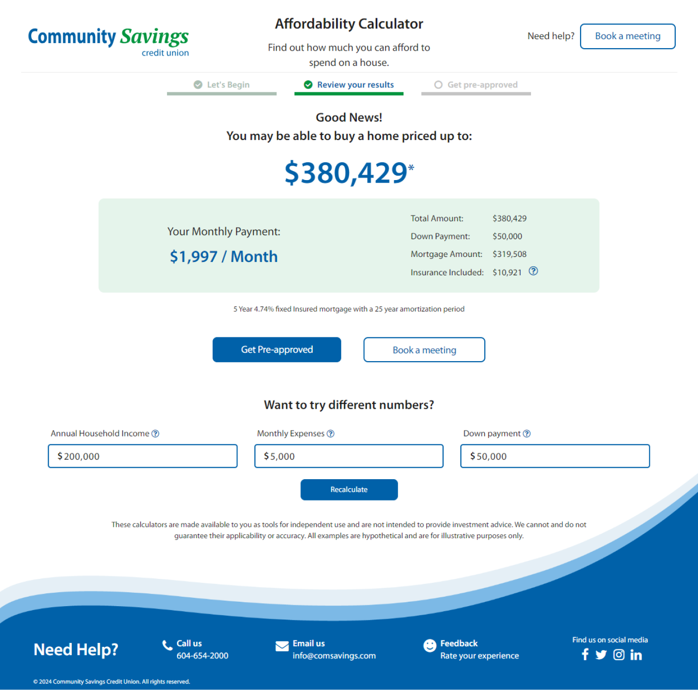
Usability testing revealed that users could immediately see results and easily proceed if interested. The fully online approval process allowed users to complete the mortgage journey seamlessly.
Initial Performance
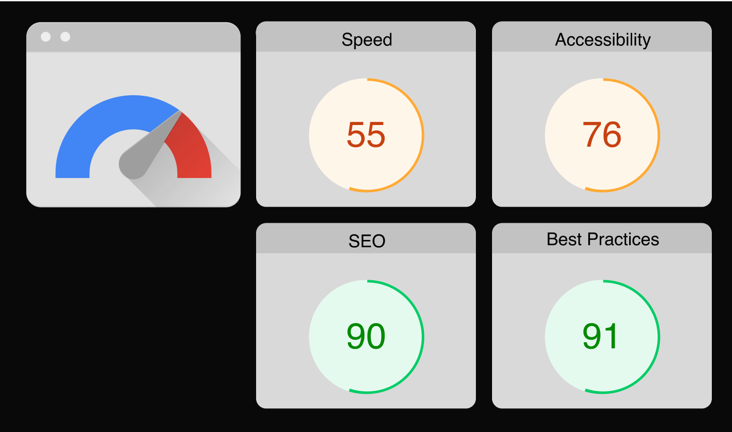
Analytics revealed slow loading times and a bounce rate far above the industry average, reflecting low user engagement and frustration.
New Performance
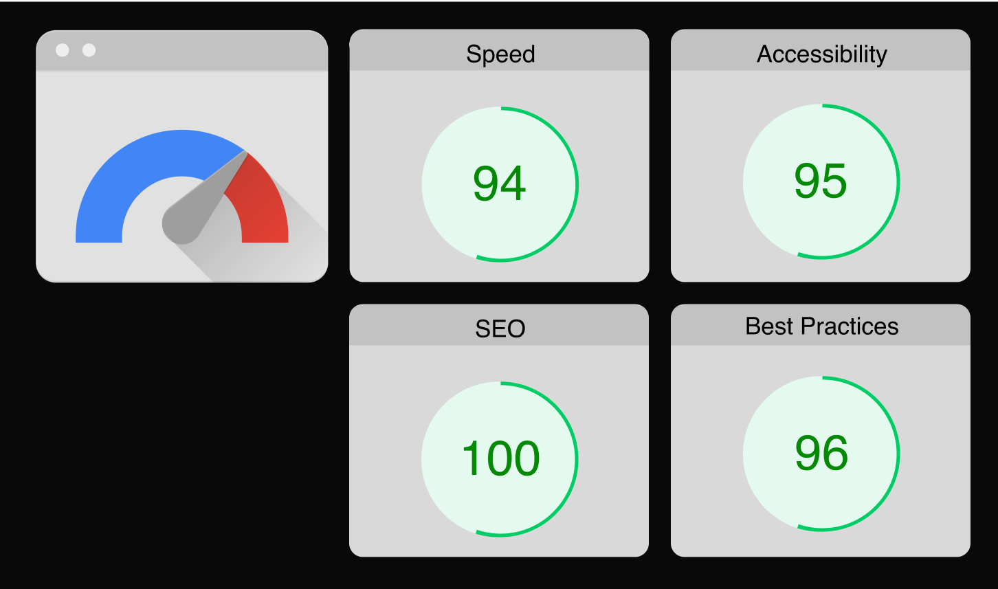
A custom-coded page improved speed significantly, reducing the bounce rate by 50%. Users engaged more effectively, demonstrating the impact of faster, optimized performance.
Initial Mortgage Page
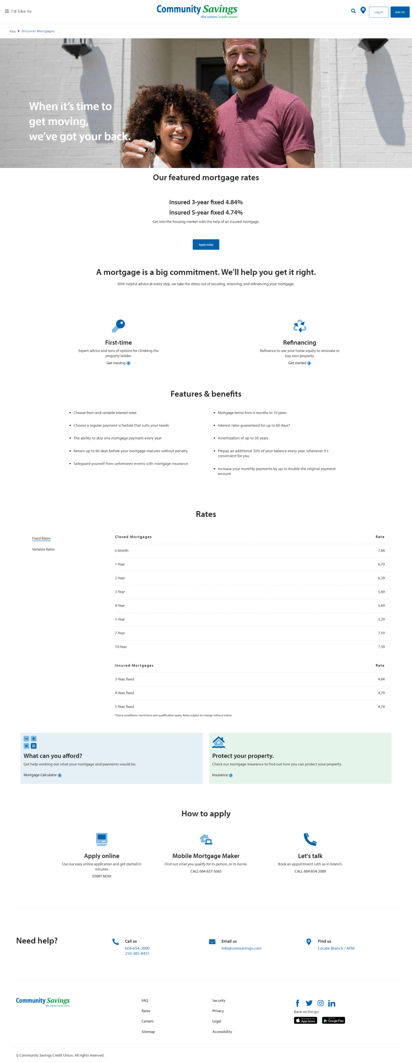
The old mortgage page overwhelmed users with too much information upfront, especially sections like rates, which were irrelevant for early-stage users.
New Mortgage Page
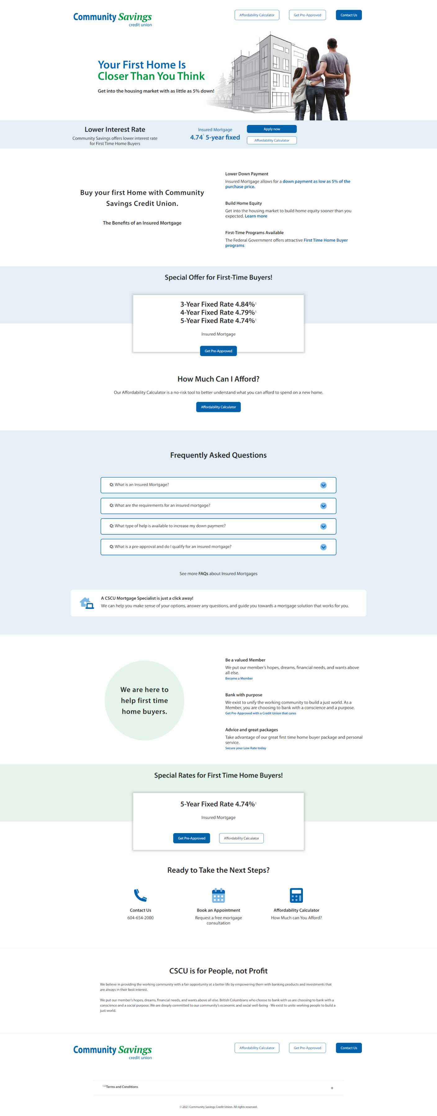
The redesigned page streamlined navigation and prioritized relevant content, allowing users to find information faster. Positive feedback confirmed the design’s success in enhancing usability